PROJECT SUMMARY
The ultimate goal of SideDoor was to empower users in the real estate market to complete transactions on their own, ultimately saving around 6% of their home value. My role was to design and develop the UI alongside one backend developer. We used Bootstrap, LESS, CakePhp, Illustrator, and Photoshop.
Problem Space
The average home owner pays a real estate agent 6% of their home value when selling their home. On a $250,000 house sale, sellers would pay roughly $15,000. In contrast, sellers who choose to use a real estate attorney, who are able to handle the legal transaction, pay around $1,000. Many buyers want to maximize profits when selling their home, but are intimidated by the process and potential risks of selling on their own. SideDoor was created to empower homeowners as they go through the process of selling their home by connecting them with buyers and other resources such as real estate attorneys, title companies, and mortgage lenders.
Challenges
A significant barrier that SideDoor was facing in the real estate market was the status quo and the present mindset around how real estate transactions should take place. Real estate agents have a hold on the market, often being the only ones with access to the MLS, where most properties for sale are listed. And because most buyers use real estate agents, home owners are only able to obtain visibility by going through a realtor.
When I was hired, the company was facing three major challenges with their platform. Based on insights uncovered from analytics data related to drop off rates, users were having trouble creating listings, searching for new listings, and more generally lacked understanding about the purpose of SideDoor and what they were able to do on the site as a whole.
Result
The result was an easy-to-use platform that effectively enabled users to buy and sell homes and to be connected with helpful resources throughout the process. The SideDoor user base increased consistently after implementing these changes and continued to grow over the course of the following year.
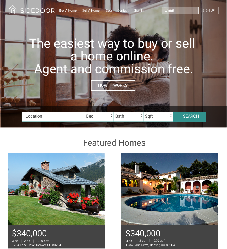
Information for Users
I began with informational pages to address the issue of users not knowing what SideDoor was and what could be done on the site. These pages guided users through the process of buying and selling with SideDoor, including potential savings they could have.
Searching for Properties
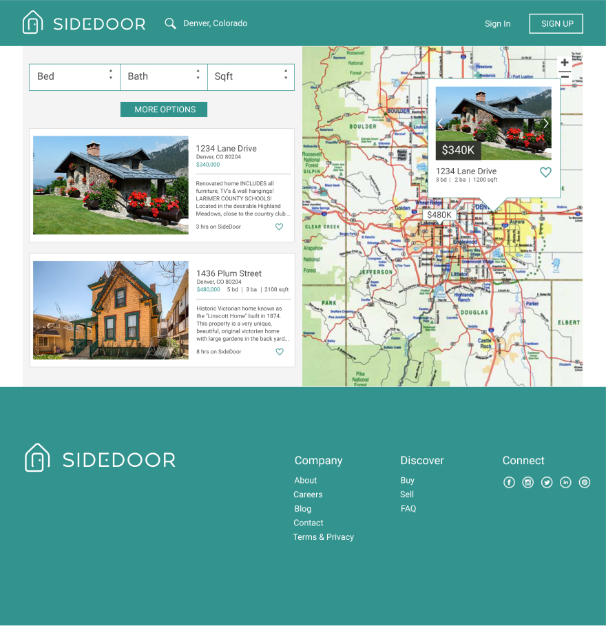
When creating the property search page, I focused on presenting key information without overwhelming the user with options. I included a detailed filter option list that reflected the variety of property features available in the market at that time. I used clear visual cues to draw users attention to key details such as price and an icon for users to save the property to their favorites list.
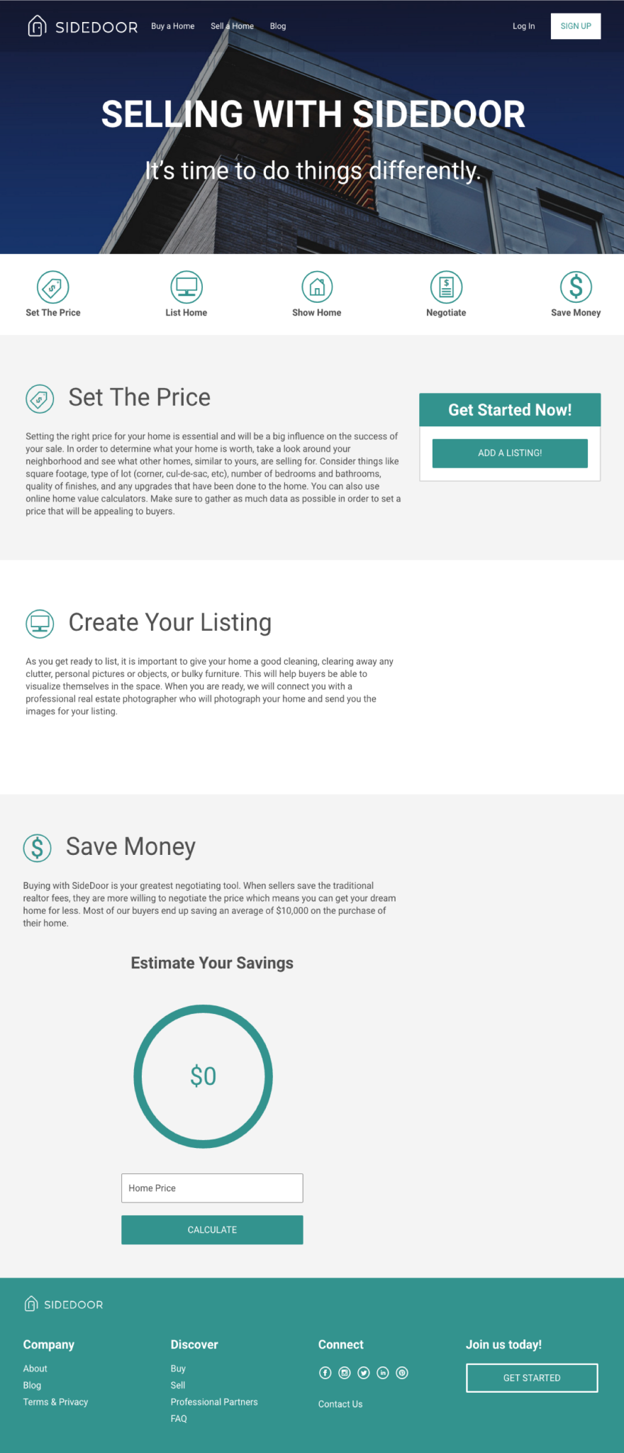
Creating a Listing
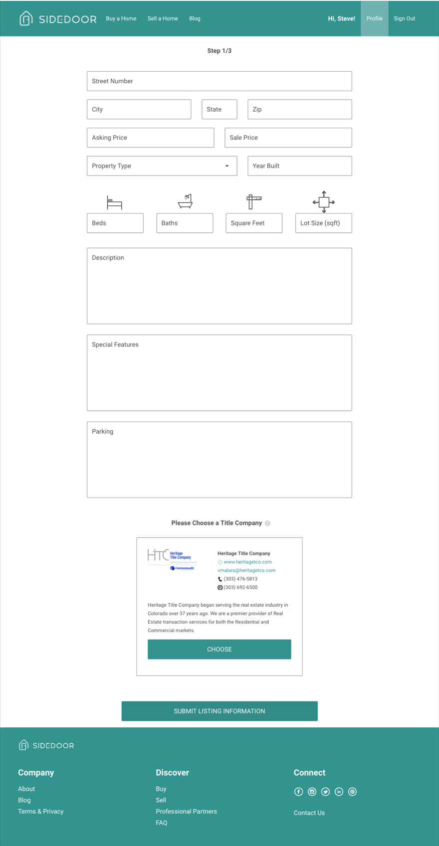
As I considered the listing creation tool for potential sellers on SideDoor’s platform, I wanted to reduce the cognitive load on the user, leaving the system to do the heavy lifting. In order to accomplish this, I organized input fields based on importance and similarity, making the most important aspects of the property listing visible first, and offering clear constraints for what was required and what wasn’t. Required fields were based on research conducted about real estate listing effectiveness and what buyers were most interested in knowing about a property when searching for homes. We collected this data through competitive analysis and observing common trends in real estate listings.
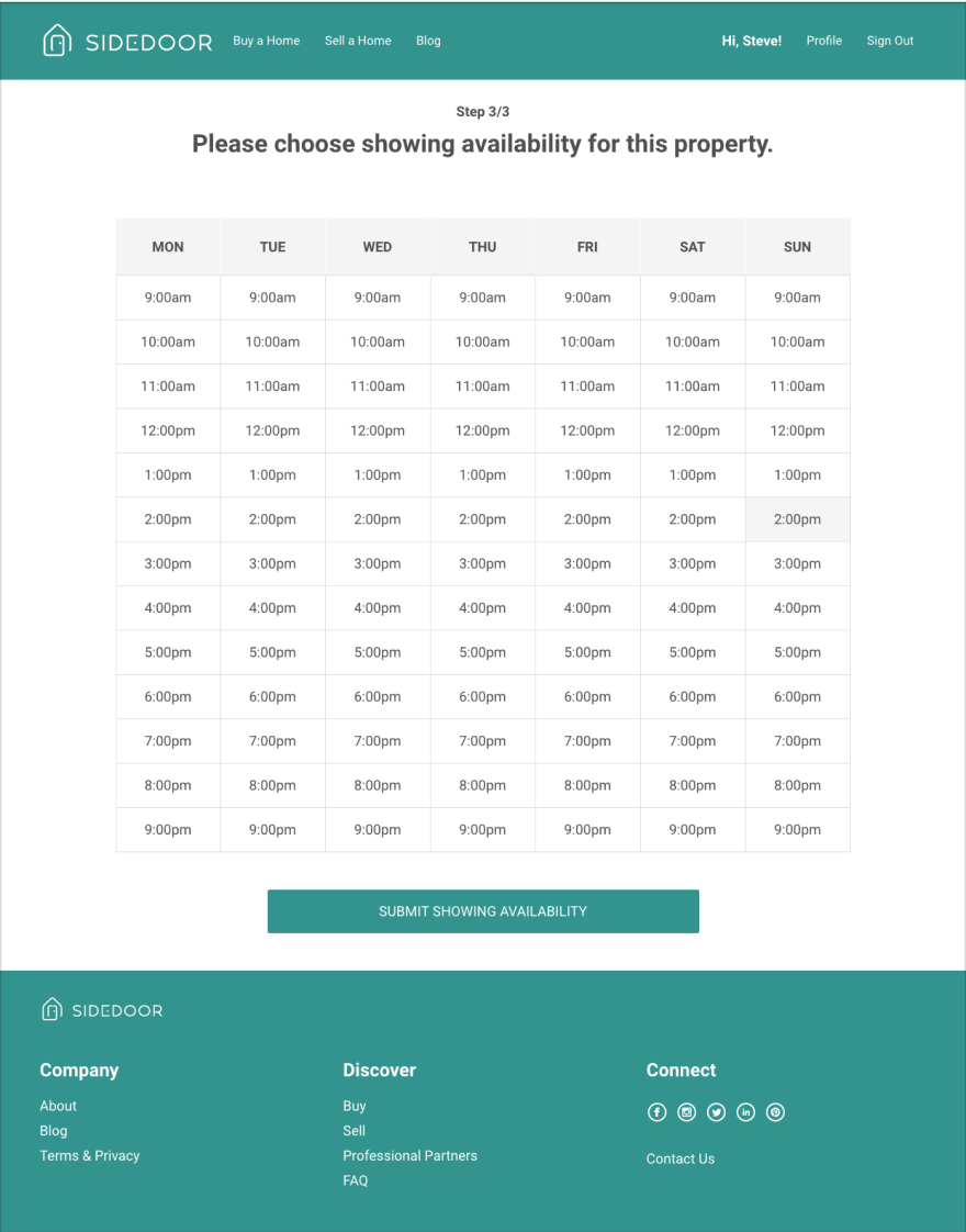
A feature that buyers felt was missing from the SideDoor platform was the ability to schedule showings to view a property. I decided to include this in the create a listing process so sellers were aware that it was a feature they could take advantage of through the SideDoor platform. This was also based on the company’s mission to connect buyers and sellers directly. Users were able to set available times for buyers to come and view their property, then connect direclty with them to finalize showing details.
Style Guide for Improved Consistency
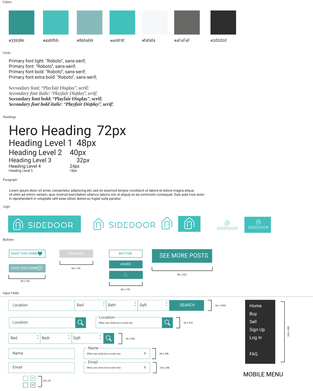
We created a living style guide on the web for this project from which we could pull components for our project. Design systems were a relatively new concept across the industry at the time and this was our team’s implementation of that emerging best practice. I started by creating a styleguide in illustrator that included typography, iconography, image sizes, and UI specifications. We then built it on the web and utilized these components throughout the project.
Process
I started by conducting some secondary research about the real estate market in Colorado. As we began to ideate, I created a general sitemap to determine user flow. I would begin each page design with a lofi sketch of the layout, then move to digital wireframes. Finally, I would integrate content, brand colors, and UI details for final review and testing. Once designs were finalized, I began building the frontend of each page, passing them along to the backend before pushing to production.
Background Research
For the research phase, I focused on analytics data that SideDoor had when I was hired. I paid particular attention to drop off points where users were leaving the site and tried to determine what problems they could be running into.
Another part of research was conducting competitive analysis. I wanted to get a clear understanding of the problem state and what others were doing to address this problem. I looked closely at Redfin, Zillow, and Trelora which were all attempting to aid buyers and sellers in non traditional ways. There wasn’t anyone that took on the same unique approach that SideDoor is attempting; which is to connect buyers with sellers directly without the need for real estate agents throughout the entire process.
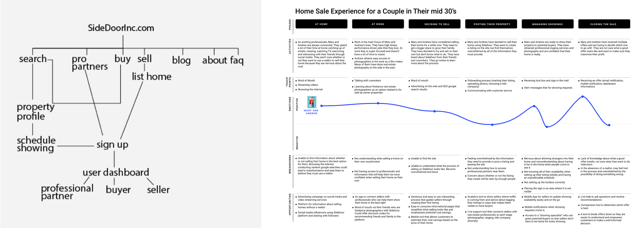
After understanding the problem space a little more clearly, I set out to design the experience. I created a general site map and customer journey maps to determine how users would flow through our site as a buyer, a seller, and an affiliate partner.
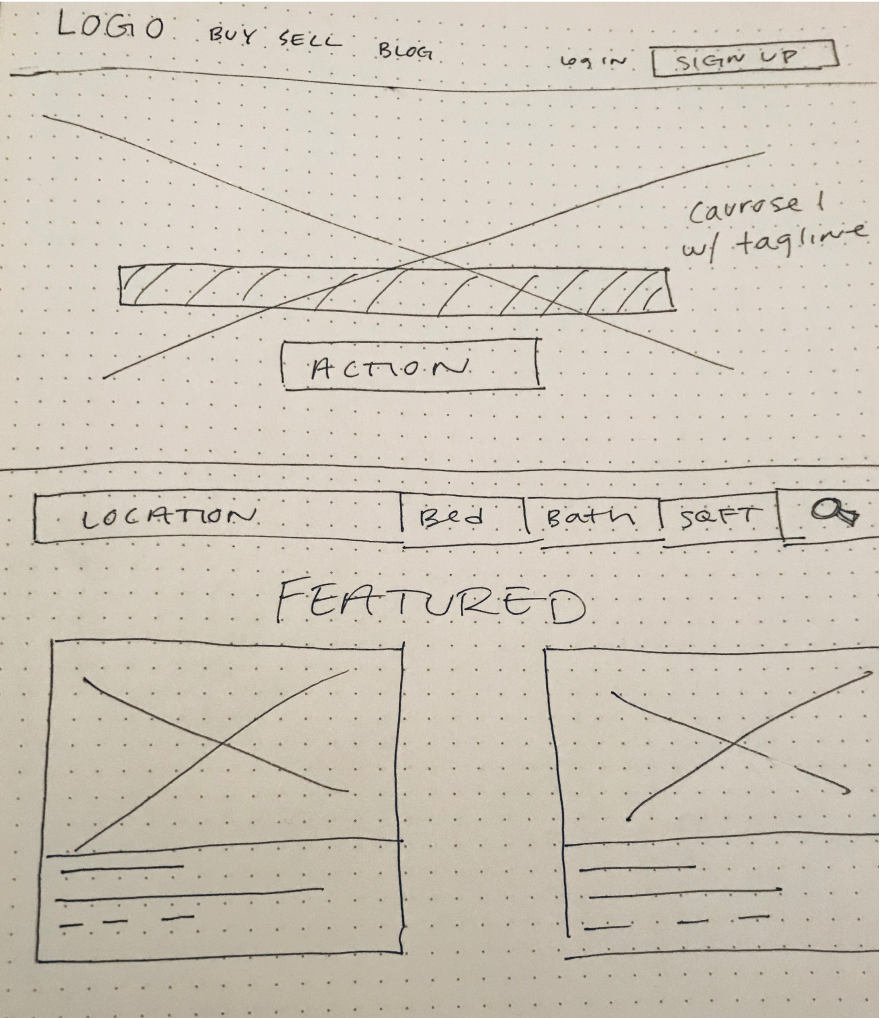
I created low fidelity wireframes for each page before moving on to mid and high fidelity mockups. I followed this process to obtain feedback early and iterate based on that feedback quickly. Medium and high fidelity mockups were created based on feedback from low fidelity wireframes.