PROJECT SUMMARY
Over the course of a year, I worked as the lead product designer to execute a visual UI/UX refresh of the Macrostax web-based application. The goals of a UI refresh was to improve the overall look and feel of the app, enhance usability, and design key features that would increase retention and reduce churn over time. I was asked to improve the current app to a level that would sustainably support our user base while we worked on other key product initiatives in the near future.
Problem Space
Nutrition and health related goals are a common pursuit for a lot of people. Often times, food tracking applications focus of caloric deficits meant to support users in reaching physical goals related to weight loss or muscle gain. The issue with most of these applications and diet methodologies is that the caloric deficit is too high to maintain long-term and is not supportive of sustainable lifestyle shifts. Macrostax strives to address this problem by encouraging users to sustain a higher caloric intake over time and emphasizing balance between three main macro nutrients: carbohydrates, proteins, and fats.
Challenges
Macrostax users want to fuel their bodies and make positive behavioral changes in their lives with support and accountability. Macrostax offers higher caloric recommendations than their competitors with a focus on nutritionally dense and balanced food which leaves users feeling energized instead of starving. Currently there are several key features that are meant to support users in these goals. However, these features are difficult to find and use, often increasing the level of frustration that is commonly associated with nutrition and diet related behavior changes.
Daily active users of Macrostax have learned onerous work-arounds to achieve success while new users often get frustrated and leave as evidenced by a common 2 month churn cycle. The app has the potential to reduce stress and make nutrition something that is fun and easy for anyone. My goal has been to improve the usability of the application by surfacing key features, improving accessibility, and providing positive feedback when users ate nutritionally dense food throughout the day. I want newcomers and expert users alike to more readily experience the benefits of properly fueling their bodies with food!
Result
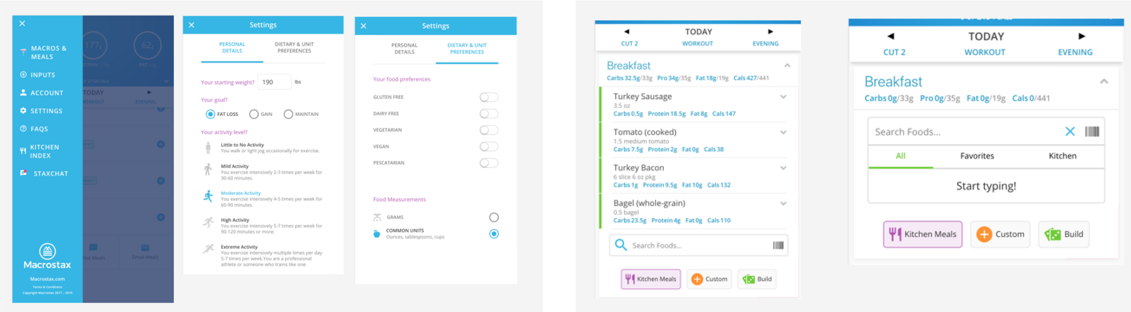
The result is a refreshed UI that focuses more on accessibility, ease of use, information discovery, and task completion. There are visual elements that support this result such as typography enhancements, better color contrast, and iconography. There are also additional user experience features such as a fixed footer for navigation clarity, a global recipe search engine that highlights Macrostax’s ability to “fill” user’s macro targets as well as a new “add food” flow that provides more clarity and focus around adding food to the tracker.
Visual UI components that reduce cognitive load
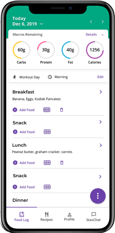
Providing more visual clarity has a significant impact on the cognitive load that users may experience while performing a task. Specifically, I introduced more structure and organization to the food log landing page, made color changes in order to meet WebAIM accessibility guidelines, improved readability using font weight, size, and information architecture, and improved color consistency to indicate meaning for button states and data visualizations.
Simplified recipe search
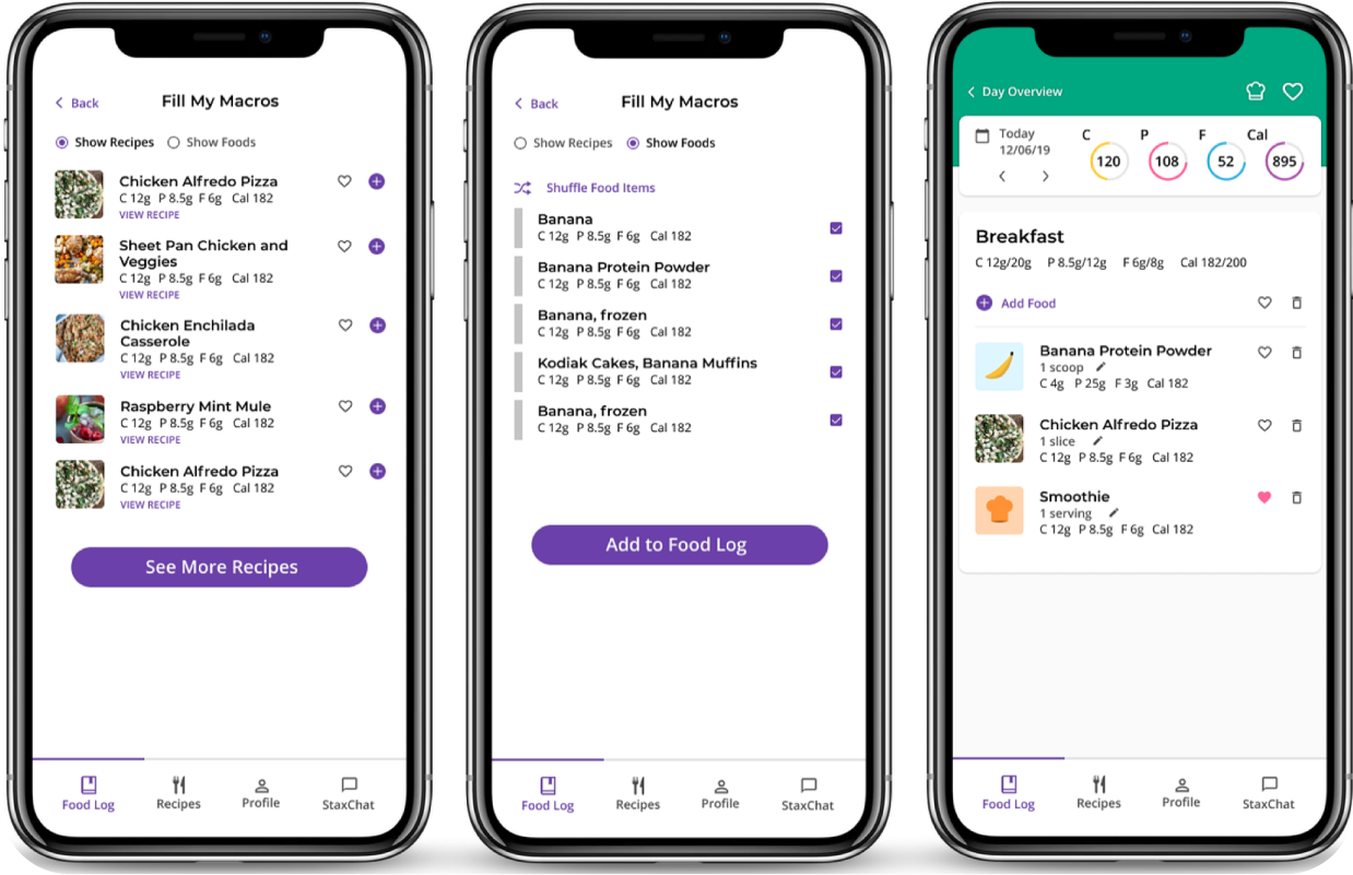
Macrostax has a robust recipe library that users can now browse more easily outside of the context of adding food to each individual meal. They are able to browse all recipes, see a select list of ‘featured recipes’, or only view recipes that will ‘fill’ their macro targets for a given day or meal.
Users are also able to save their favorite recipes to revisit later without having to add them to their food log. By providing these options and surfacing the “fill macros” feature, users are empowered to tailor their experience and receive support in achieving their health related goals.
Iconography and labeling to improve scanability

By introducing more help text and labeling on buttons and icons, the behavior and functionality of interactive elements becomes more clear, providing orientation and grounding at all stages of interaction.
Global and local navigation for focused task completion
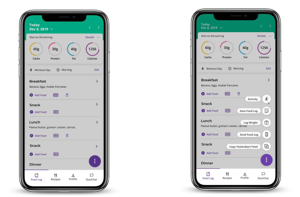
The UI now visually promotes clear separation between global and local navigation. Daily tasks live in a FAB menu, global app navigation lives in the footer component, navigation through the current section of the app happens in the header component. This promotes tight coupling of navigation elements, focused task completion, and aids in orienting users more effectively while using the app.
An improved flow for adding food
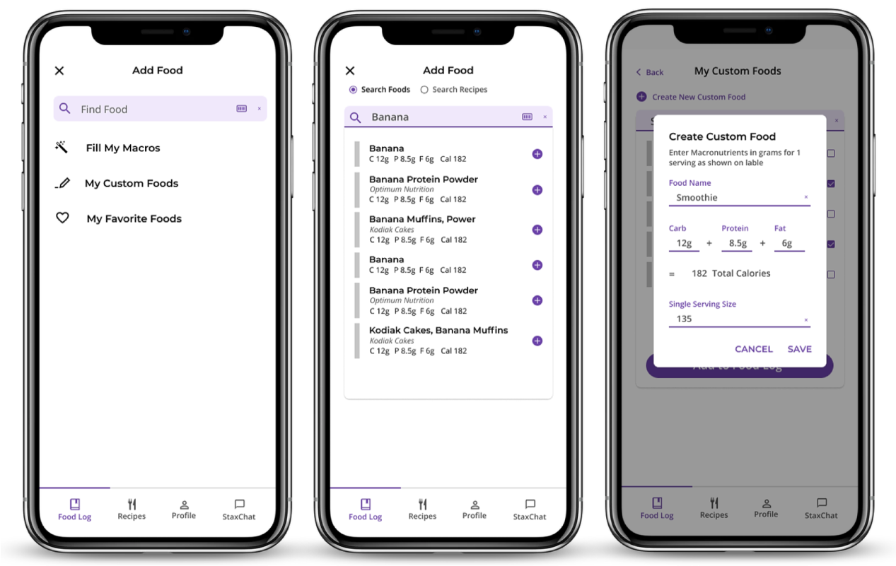
Users are able to search for and find food items that best meet their needs via a separate menu and add food flow.
If users are unable to find the foods they are looking for, they can create and manage custom foods, specifying ingredients and macro nutrients themselves.
Macro Magic and Managing Food Log
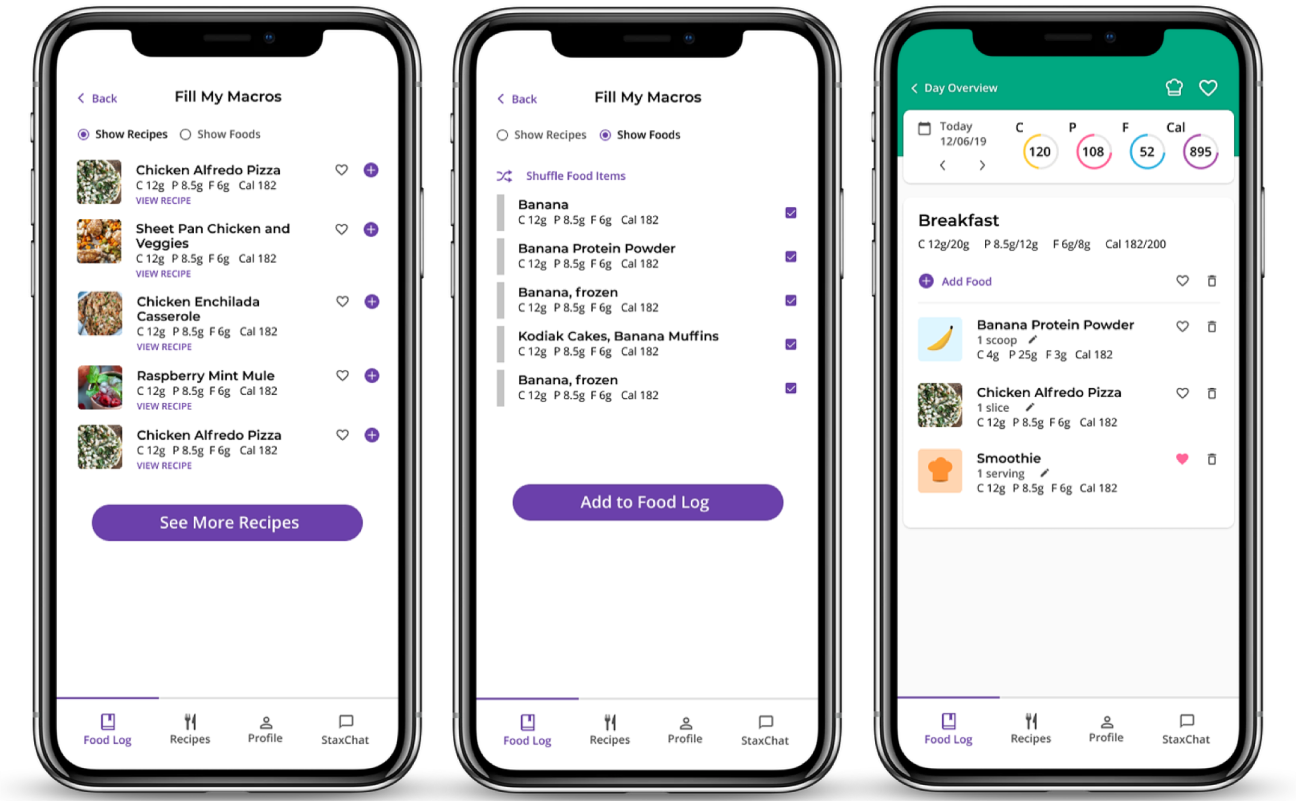
When a user is adding food to their food log, they are given the option to browse a selection of recipes or explore different combinations of individual food items to have their macros “filled” for them.
Once a food item is added to their food log, the system offers a notification that something has been added successfully. Users are then able to see an overview of food items they have added to specific meals, see how those items impact their macro targets, and make serving size adjustments as needed.
Process
I started out trying to develop a better understanding of macro counting in general, the current state of the Macrostax application, how users are engaging with it, and identifying the key pain points that they were experiencing while trying to complete daily tasks. This took the form of secondary research, interviewing current employees who built the app, interviewing current Macrostax users and performing usability studies, and using the app myself for about 6 weeks.
Background Research
My research phase began by developing a baseline understanding of the current state of Macrostax and the nutrition and diet tracking industry as a whole.
I began with a competitive analysis to identify opportunities and to document heuristics and UI patterns for nutrition tracking. Along with this, I conducted several interviews with those who built Macrostax and those who use Macrostax. I also interviewed all current employees at Macrostax, asking them what they saw as key features and opportunities. Finally, I spoke with current Macrostax users about their experience and poured over survey data from former customers who had left the app.
Key Findings
Finding 1. Key features are undiscoverable
One of the best features that Macrostax offers its users is tailored macro numbers based on activity levels and the resulting recipe recommendations that will enable users to easily hit their nutrition goals from day to day. This feature was completely hidden from view and the benefits weren’t clearly explained once a user was able to find it.
Most of the users that I spoke to weren’t even aware that this feature existed. Once I told them about it, they wanted to use it all the time.
Finding 2. The app is exhausting to interact with and visually inconsistent
Users struggled to consume key visual components and were left feeling confused and lost most of the time while using the app. These struggles were commonly associated with small text, lack of color contrast between text color and background color, hidden elements, and unclear iconography.
The app was providing little to no visual affordances for the purpose of key components associated with completing important tasks.
Finding 3. Adding food is unreasonably difficult
Many expert users had learned pretty extensive work-arounds to make adding food “work” for them. A task that is key to experiencing success in the app had become so difficult that most users gave up before they had even started.
This flow lacked clarity, focus, and was generally overwhelming because the app provided little to no guidance or shortcuts.
Finding 4. Lack of feedback left users feeling lost
It was difficult for users to know if the app had received their input. Once a user completed a task, there were no visual cues that the task had been completed. This was especially frustrating when a user was adding food and wanted to make sure that the food they were trying to add to their tracker was in fact added to their tracker.
Understanding Macrostax
It was difficult for users to know if the app had received their input. Once a user completed a task, there were no visual cues that the task had been completed. This was especially frustrating when a user was adding food and wanted to make sure that the food they were trying to add to their tracker was in fact added to their tracker.
A few important things that I wanted to focus on were: improving over all readability and accessibility throughout the app, highlighting the awesome features that most users were overlooking, improving visual consistency, and introducing new features that could enhance the user experience.
Prioritizing UX/UI Improvements
With all of this data in hand, I worked with engineers and company leadership to lay out a roadmap for how we could tackle some key usability concerns while at the same time improving the look and feel of the app and adding new features. I led the initiative to develop a UI refresh release roadmap along with a more formal product development cycle. We collaborated to determine what workflow would work best for each department and then committed to an iterative product development cycle focused on feature versioning and based on 3 week product development sprints. The idea was to make reasonable timelines and chunk work into 3 week versions with the goal of having a release every 3 weeks.
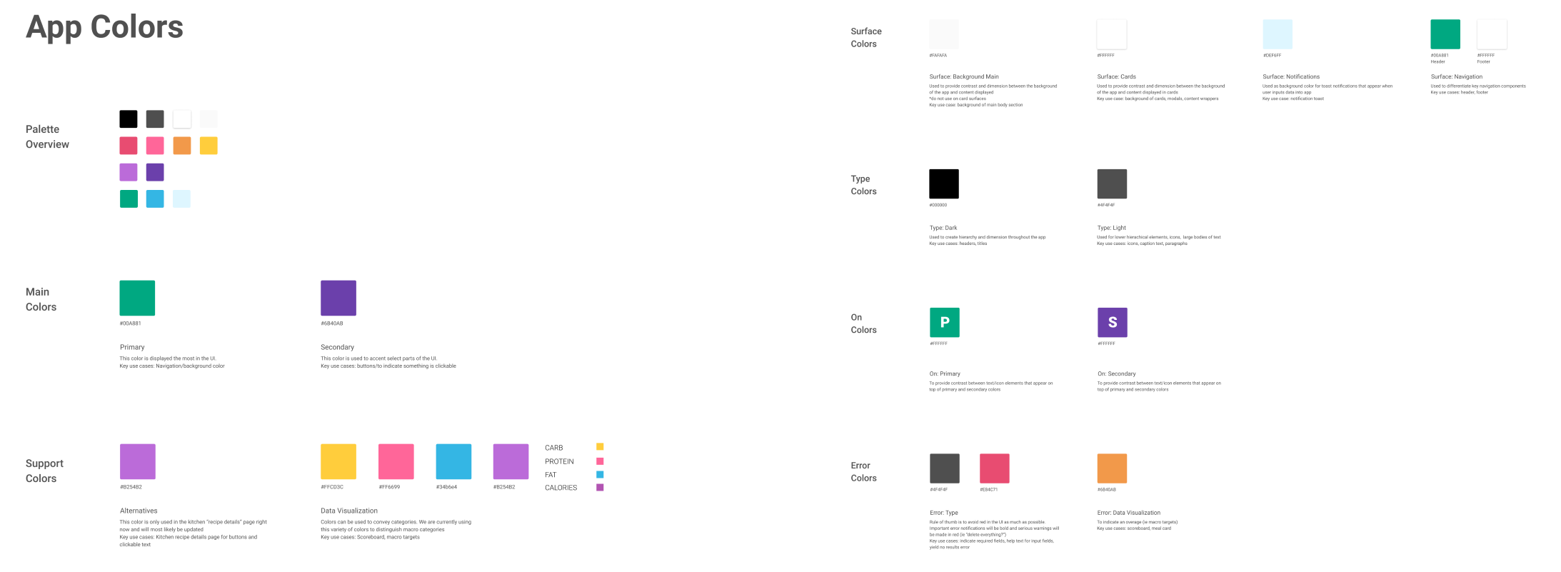
As we moved forward with the UI refresh project, we wanted to focus of sustainability in our design and development process. As part of this, I defined the design language for the product, developing a design system used across the application in order to improve consistency and accessibility, ease the development process, and encourage collaboration between design and engineering. A design system helps to ensure that the quality of the app is maintained as we scale our product and team in the future as well.
Usability Testing
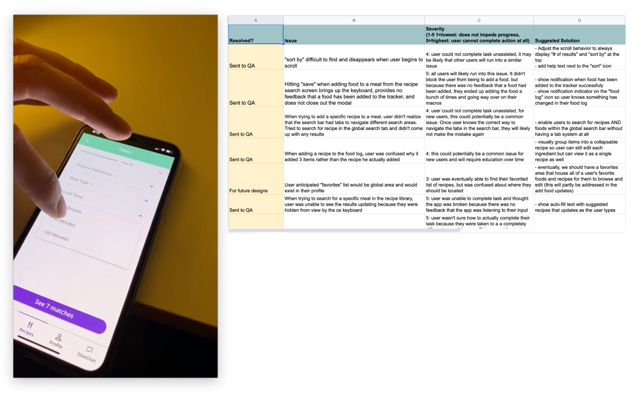
At the end of each development cycle, before moving forward with QA and the final release, I would conduct usability tests with 3-5 users. These usability tests were typically structured as think aloud protocols and focused on users completing key tasks in the app with the hope of uncovering important issues that impact key task flows. When issues were discovered, they were rank based on severity, the likelihood that other users will experience the same issue, and the level of difficulty it would be fix them in engineering. I then provided recommendations to the engineering team as well as company leadership.