PROJECT SUMMARY
Over the course of 15 weeks, I worked on a small team with one other designer and our advisor to understand barriers women face when accessing healthcare. This was a passion project of ours, something that hit very close to home, and we were excited to use design thinking to create a meaningful intervention in this space. My role was User Researcher and UX Designer. Our primary goal was to alleviate some of the fear, stress, confusion, and burden women feel when navigating their health.
Problem Space
Getting specialized female reproductive care is an important part of any women’s health. Studies show, however, that a high percentage of women have fears about the care they receive from gynecologists and reluctance to access care. So, how can we help women feel more confident about managing their feminine health?
Challenges
A significant barrier that women face when accessing medical care is fear. They are afraid facing judgment from their doctor, their friends, or their family. They are afraid that the procedures will hurt. They are afraid of the costs that they may incur.
Women’s Health is a space that is very complex and unique, influenced by many different systems each with their own complexities. As we began this project, it was very important to clearly define our focus area, be specific about our goals, and overcome our desire to solve everything.
Result
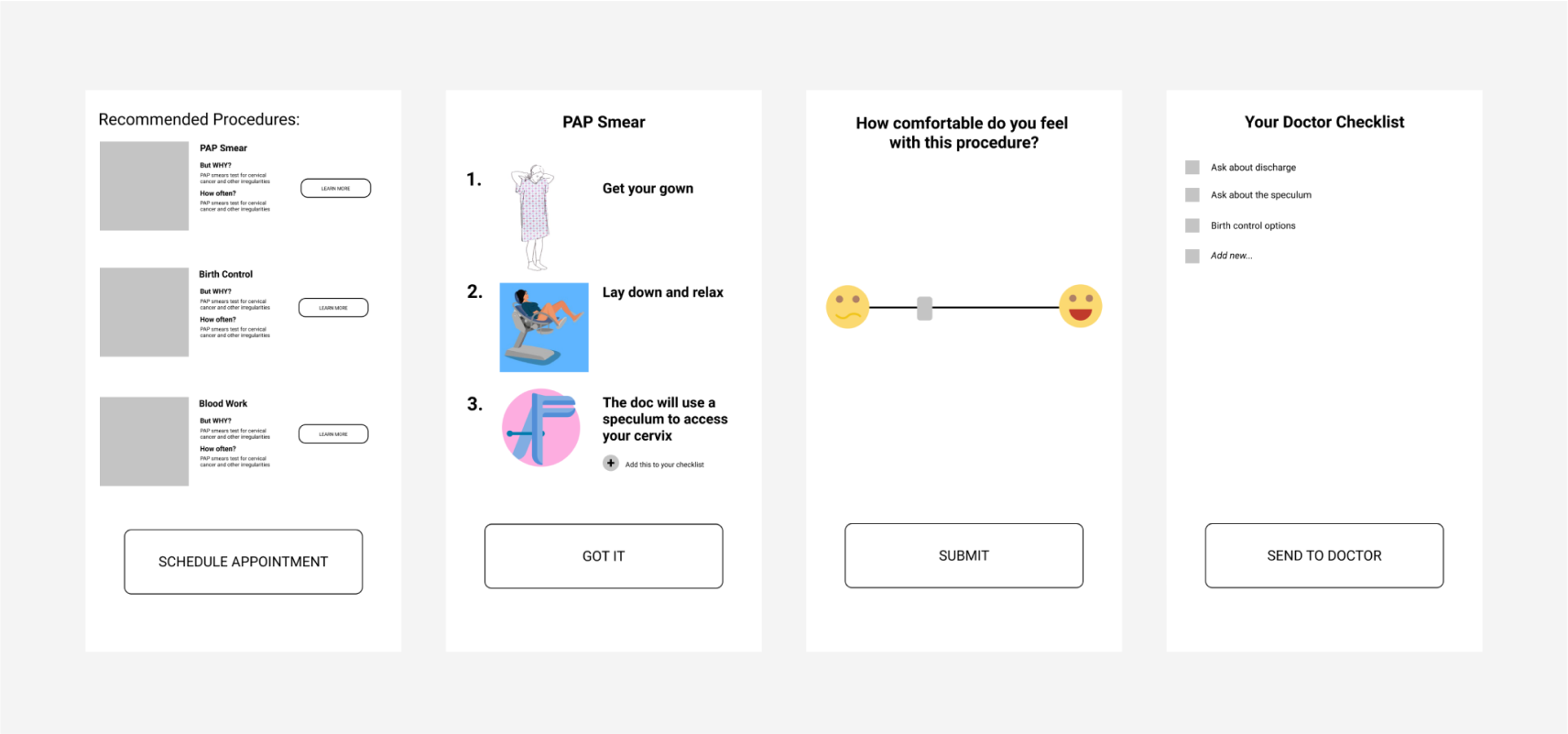
The result is Chacha a chatbot app designed to empower women in navigating and managing their feminine health. Chacha answers users’ questions, encourages users to find providers, and supports appointment scheduling and onboarding with providers. Additionally, Chacha helps users feel more prepared for appointments by keeping track of users’ list of questions they may have for their medical provider.
Intelligent Q&A
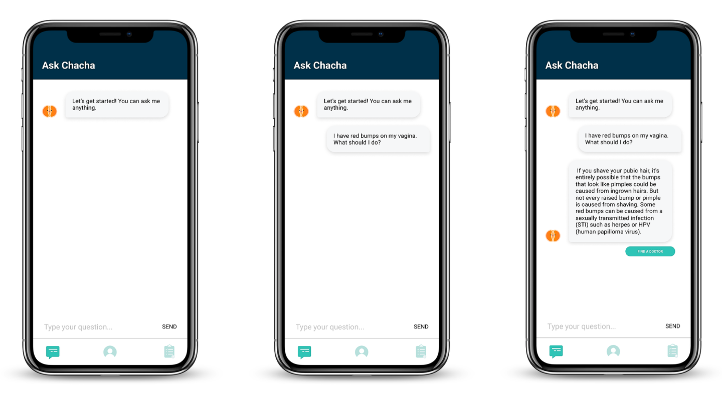
Users can ask Chacha questions related to their reproductive or sexual health. This information remains confidential unless they decide to share with their provider.
Finding providers and scheduling appointments
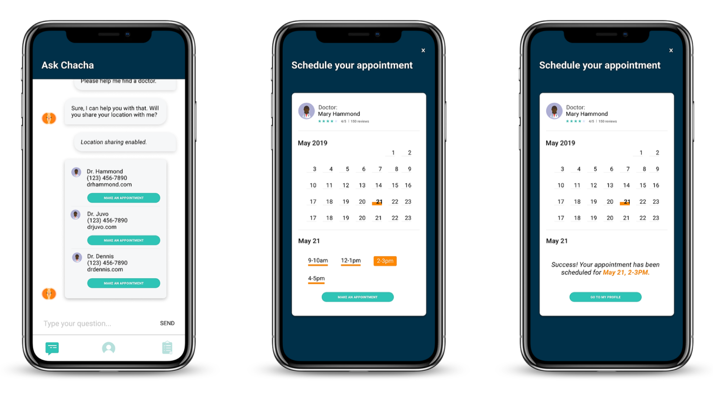
Chacha recommends doctors in their area. Users can browse providers, read reviews, and choose a provider that works best for them.
Chacha then allows users to schedule an appointment and connect with their chosen provider.
Onboarding users with their provider
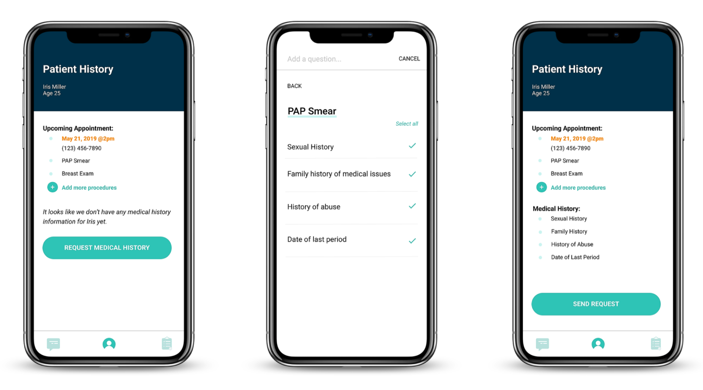
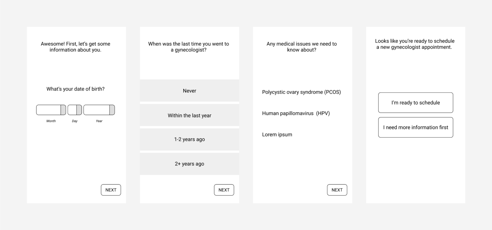
Once an appointment has been made, Chacha helps ease the onboarding process between patients and providers. Based on the patient’s scheduled appointment procedures, providers can request a patient’s medical history in advance.
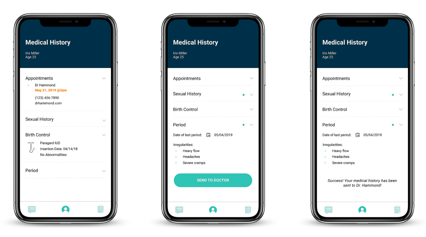
Patients can easily share medical history that is often sensitive and uncomfortable to share in person.
Preparing users for their appointment
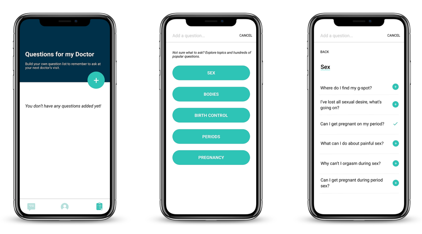
Chacha’s question checklist helps users keep track of questions they want to ask their provider at their next appointment.
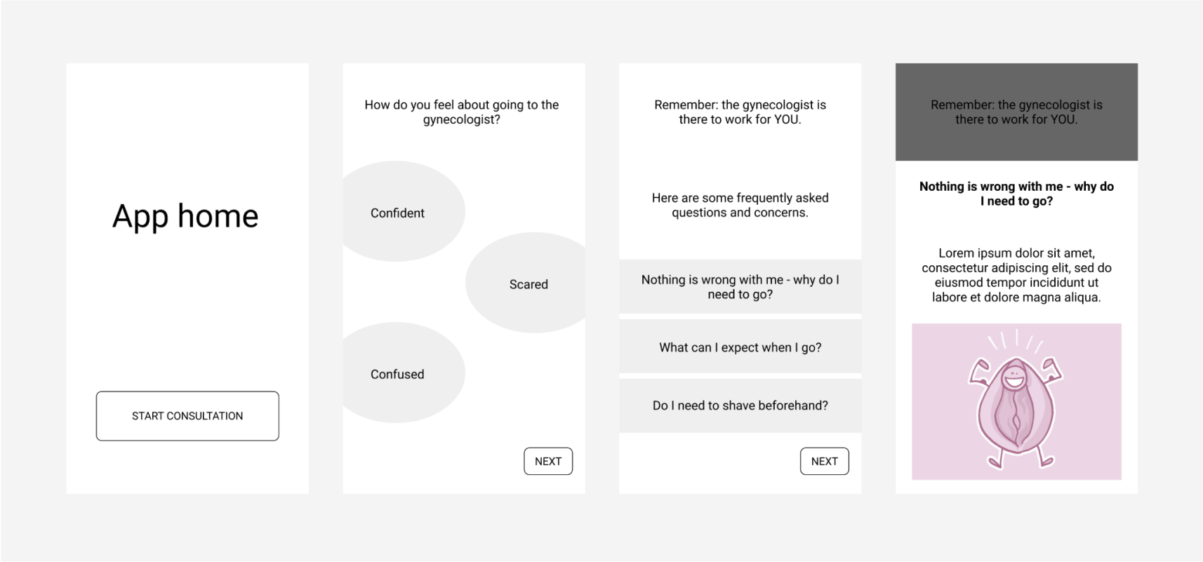
The function also helps users browse a list of popular questions to inspire questions on topics they may not have been aware of.
Process
We began by talking to professionals in the women’s health space. This, coupled with a survey and extensive secondary research into the current state, enriched our knowledge of the problem space. We also worked to involve women in the community through a co-design workshop, speed dating, desirability studies, and user testing.
Background Research
Our research phase began with the goal of better understanding the barriers women are facing when accessing healthcare services and what current interventions look like.
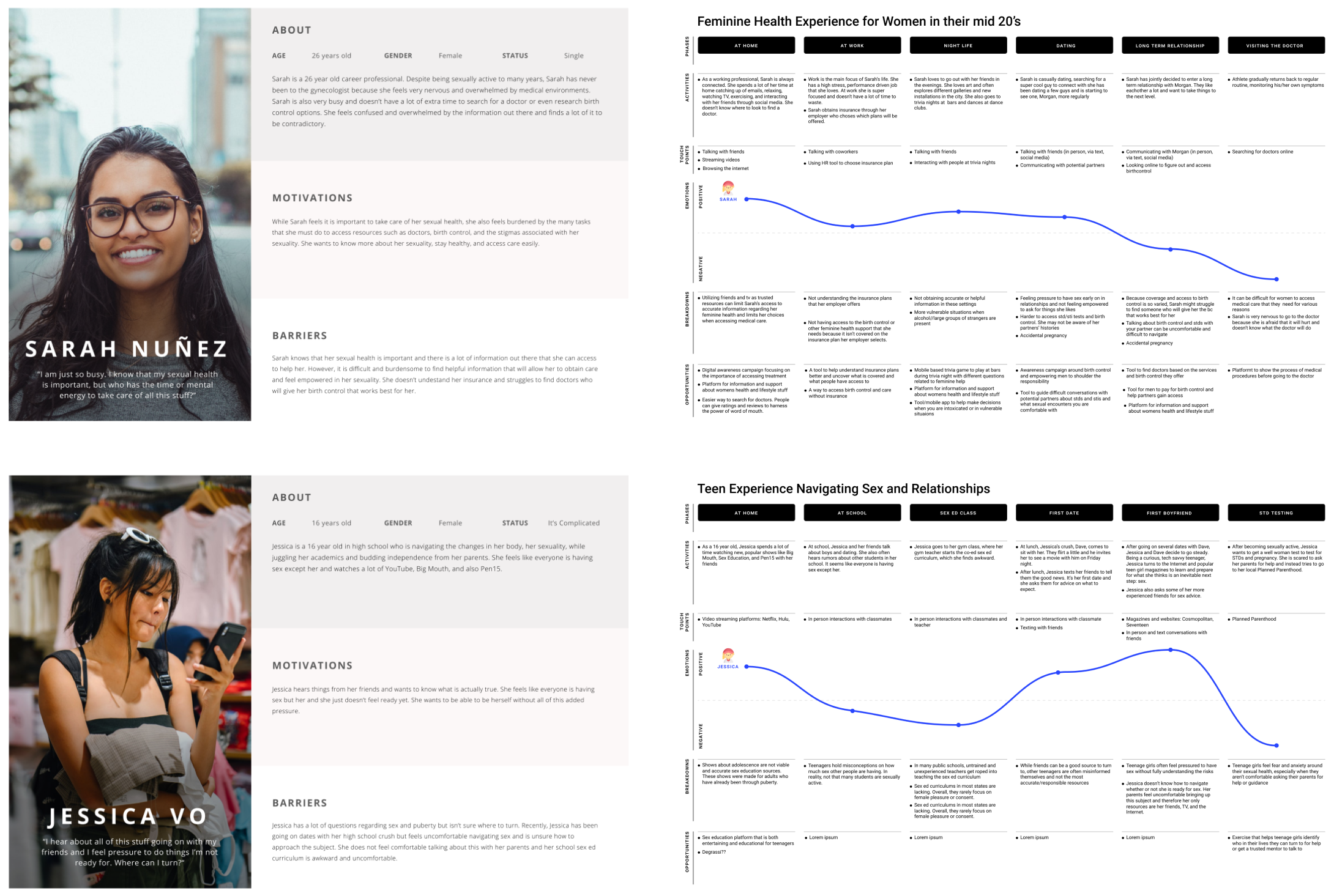
We interviewed 3 medical professionals, 3 health educators, 1 doula, and surveyed over 400 women to better understand how women view and manage their feminine health. We analyzed survey results and affinitized our interview data points to be able to identify patterns and insights. We developed personas and user journey maps to better visualize what we found.
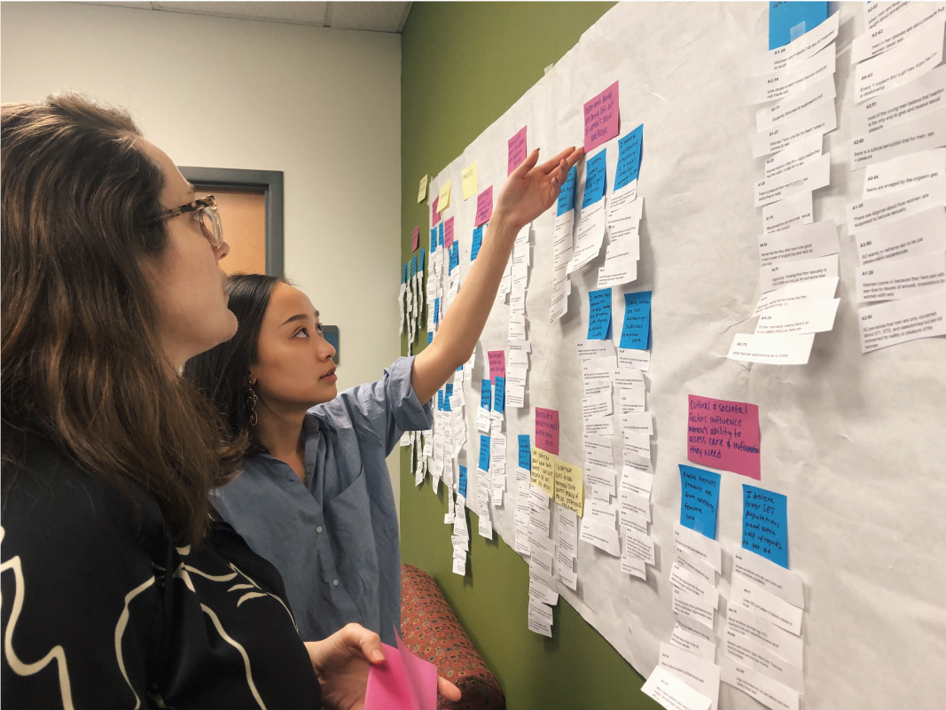
We synthesized our findings in an affinity diagram, uncovering key insights that would guide our decisions moving forward and inspire our final design concept.
Personas and User Journey Maps are helpful tools in better identifying and uncovering pain points that users experience within a system. Through these exercises, we were able to develop ideas based on key opportunity areas where an intervention would be most effective. We analyzed the context, delivery method, and technology we would use for each case.
Key Findings
Finding 1. Reactive vs proactive
Many women don’t feel a need to go to the gynecologist regularly because they generally feel healthy and don’t have any pressing medical issues that need to be addressed.
“I have not had any issues that would require me to visit a gynecologist.”
Finding 2. Fear is a primary barrier
From concerns about feeling judged to wondering whether it will hurt, women generally avoid the gynecologist because of fear.
“I’m scared - it seems awkward and uncomfortable.”
Finding 3. Power imbalances impact doctor patient relationship
The procedures commonly performed at the gynecologist oftne put women in a vulnerable position. They are unsure of what they should expect from their gynecologist and feel unprepared to even ask.
“It feels like a black box. I’m unsure what I should even be getting out of the experience.”
Finding 4. Information can be overwhelming and unreliable
We found that the primary resource women are utilizing is the internet. Anonymity, freedom from judgement, and the over all convenience were key motivators behind this behavior.
There is a wide array of information available to access here, however, it is often difficult to determine what is accurate and will be helpful in their decision-making processes.
Need Validation
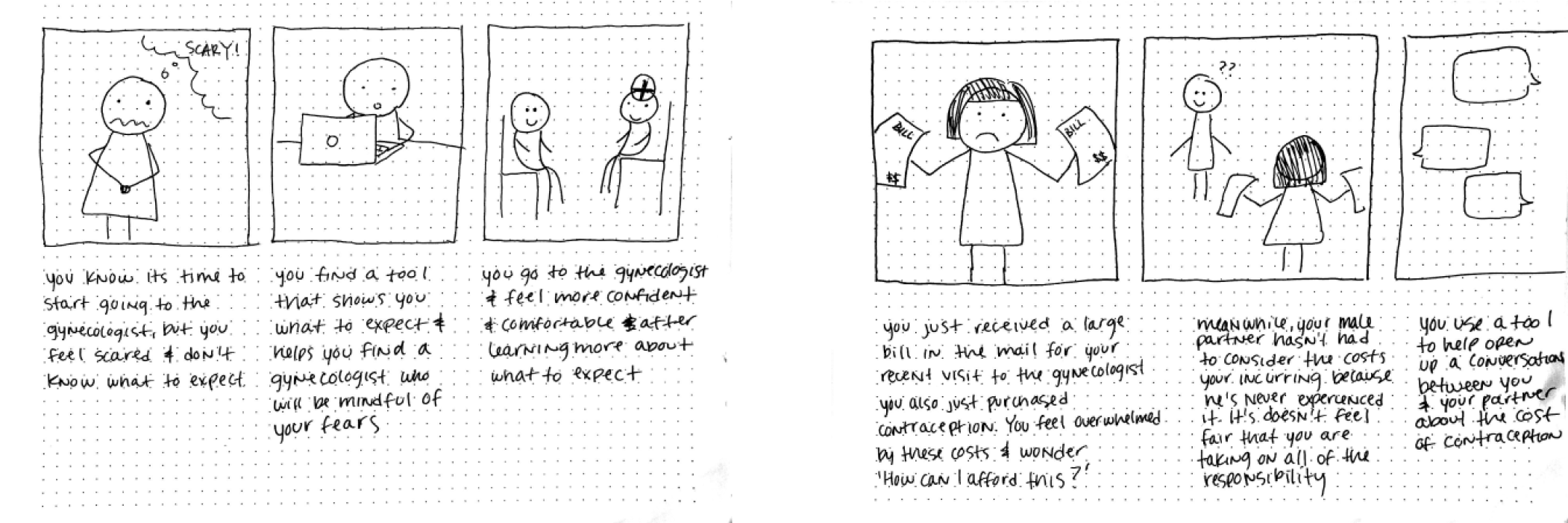
With key insights uncovered, we moved forward with ideation. We illustrated preferred futures through storyboarding and used those storyboards to speed date and validate user needs.
Ideation
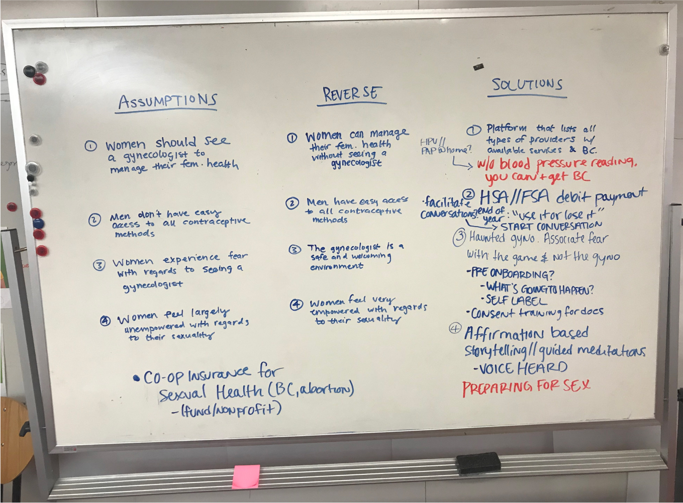
After validating user needs, we began ideating concepts for possible solutions. We conducted a reversed assumptions exercise to better understand our own assumptions of the problem space and dive into possible solutions. This exercise allowed us to more deeply analyze our insights, breathe new life into our ideas, and uncover additional opportunities that we had overlooked.
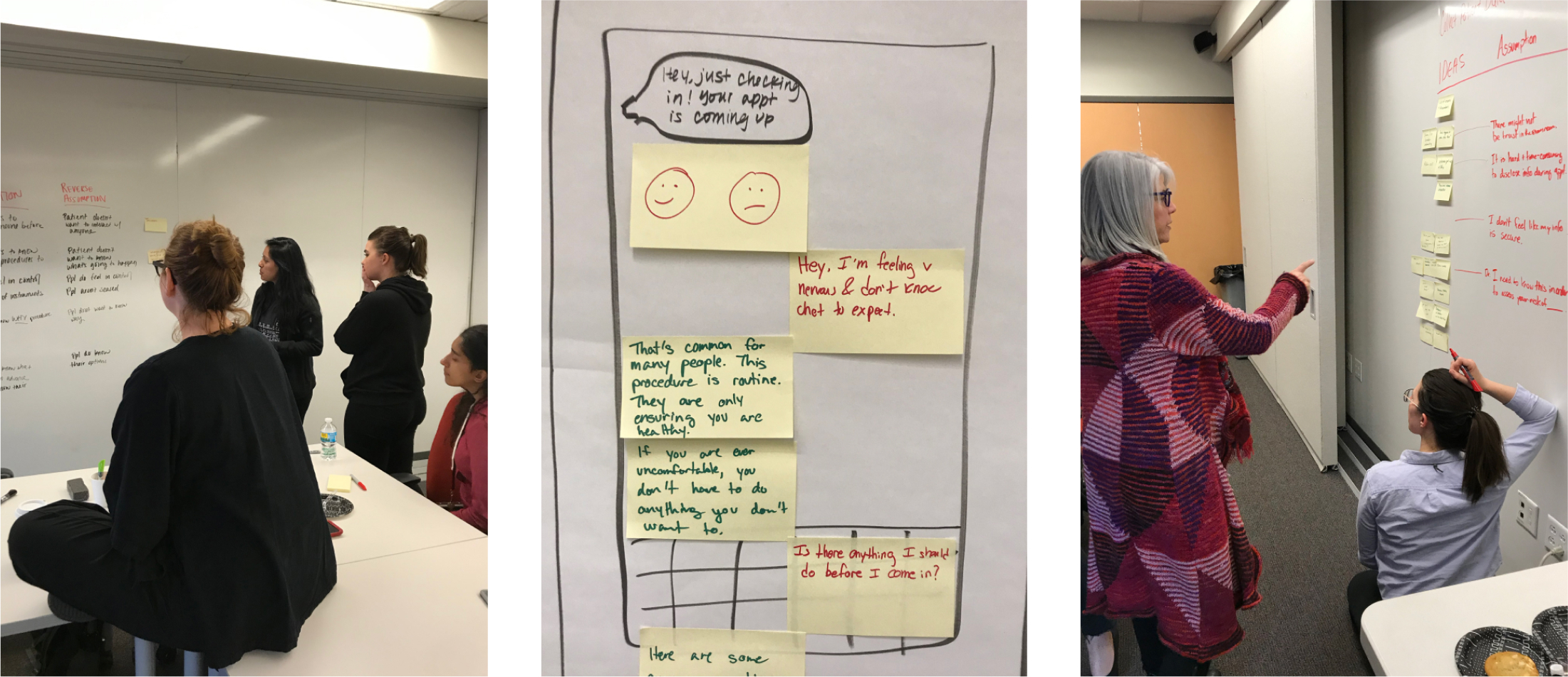
We also conducted a co-design session with members of the community ranging in age from early 20s to early 60s. The group included designers, health educators, and gynecologists. Through this workshop, we were able to develop a better understanding of the barriers women are facing when accessing healthcare and how they would like these barriers to be addressed. These learnings helped us identify our design priorities moving forward into prototyping.
Rapid Prototyping & Testing
Through an interactive design process, we quickly moved between paper to digital prototypes as well as testing with users in order to quickly learn what was valuable. We developed and tested three initial concepts with women who reported feeling uncomfortable and unconfident with their gynecological care.
Final Design Decisions
Our ideation and rapid prototyping and testing exercises allowed us to identify key features and user values that would be later incorporated into our final design decisions. We identified 3 priorities that women held in making decisions for their on feminine care.
Priority 1. Build trusted relationships
Trust is a crucial component to a positive gynecological experience. This includes trust between women and their provider as well as protecting personal medical information.
Priority 2. Simplify the process
Women don’t want to repeat sensitive information several times when going through the process of managing their feminine health. By simplifying the process, we are able to relieve unnecessary stress and inconvenience.
Priority 3. Empower women to be more prepared
Being better prepared for their gynecological appointments will enable women to get more out of the experience, ask important questions, and obtain the information they need to make crucial decisions regarding their sexual and reproductive health.
